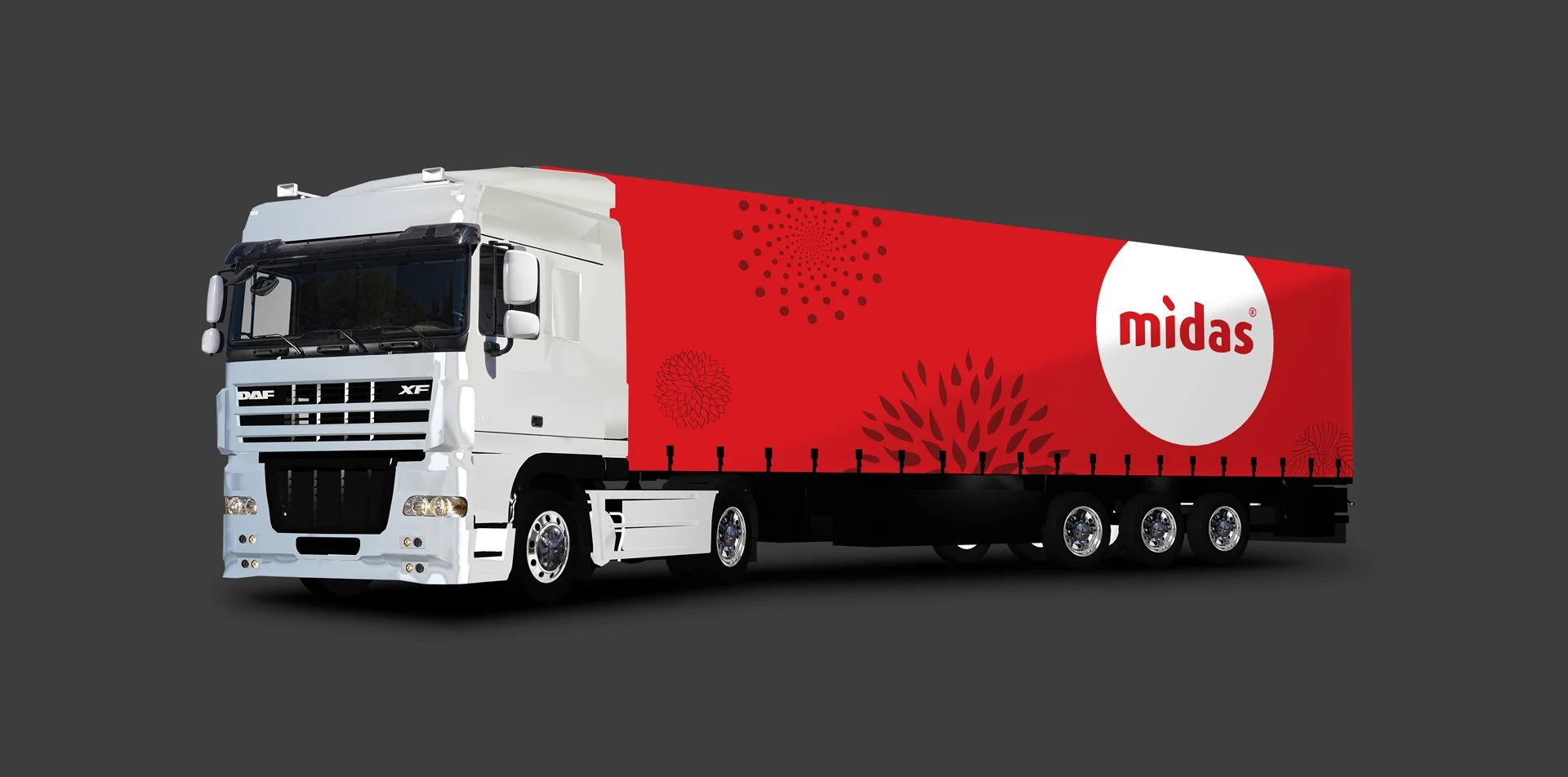
Midas Rebranding
An identity system establishing a new but familiar foundation for their visual language, capturing and building on its rich history and influence.
Process:
It began with a deep dive into the storied past of Midas. Exploring their archive, studying their products, and understanding their influence was essential to expanding the identity for the future.
Conclusion:
We emphasized the name "Midas" because it’s the most recognizable element of the brand, both to existing customers and potential ones. This approach highlights the name as the focal point, ensuring immediate brand recognition and recall. A custom font further differentiates midas from competitors, creating a unique and memorable design.
Typographic Challenge:
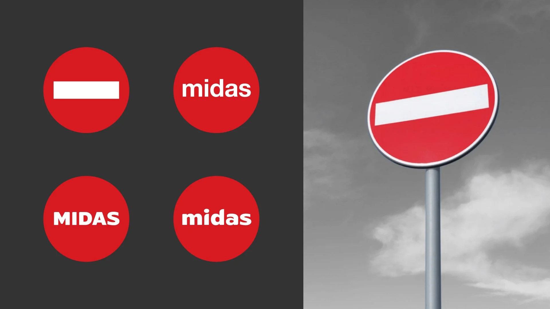
While going into several trials of fonts in a red circle. The overall visual language appearing not freindly and closer to “No Entry” street sign.
Solution:
To make Midas letters blend within the circular shape, we customized the type anatomy, creating a curve treatment with the letters on the baseline and x-height.
Graphic Elements:
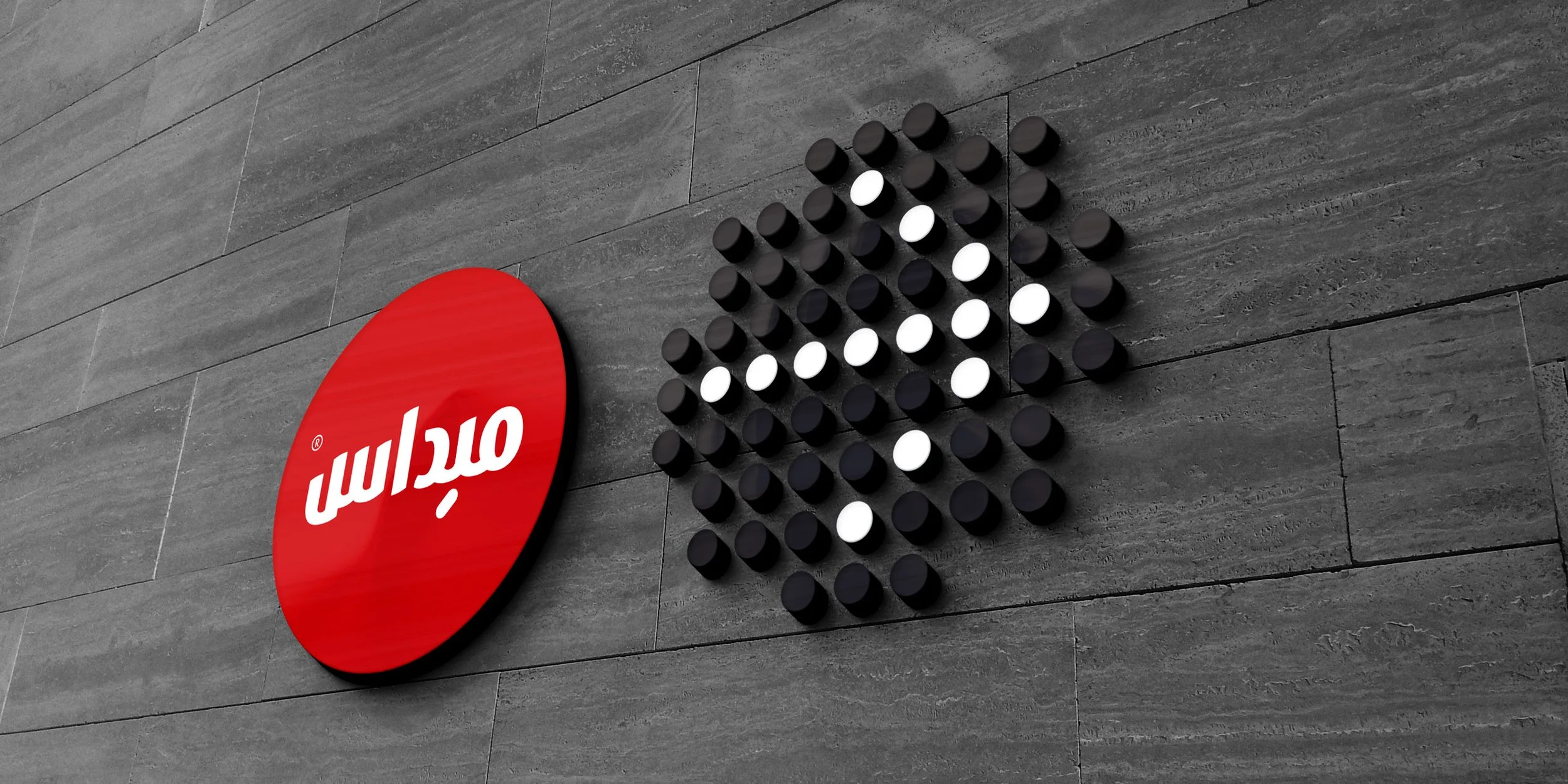
Spiral and abstract elements are delivered to reflect the dynamic and variety of products provided by Midas.
Icons:
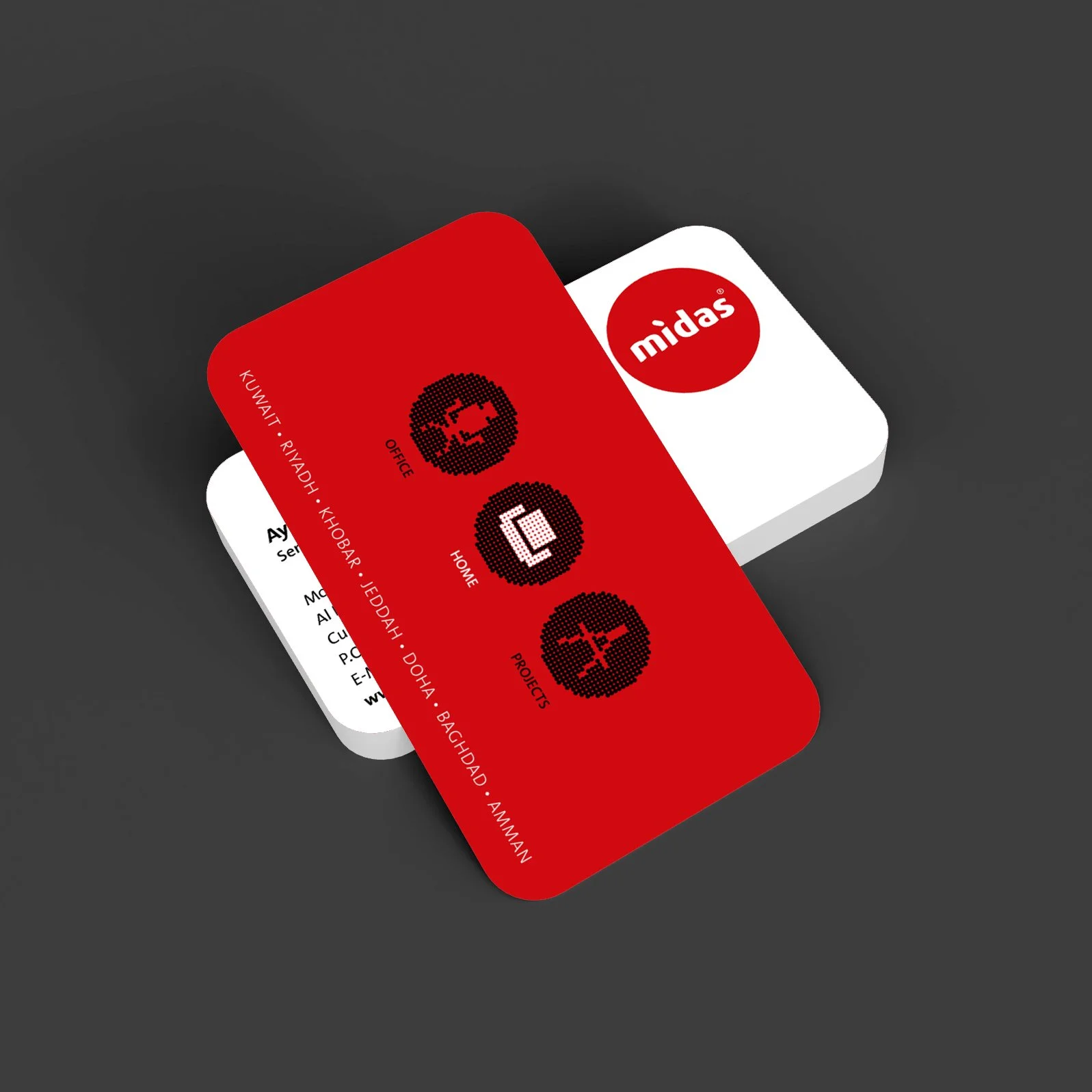
Custom icons are designed to showcase Midas divisions.
Wayfinding System:
Custom wayfinding system is developed to compliment the showrooms with the new visual identity.

